The web has come a big way. Sir Tim Berners-Lee’s invention that changd the world has undergone a large metamorphosis in the way how it provides millions – and now billions – of human beings information, communication and entertainment.
 Early websites had a fair amount of content, but it was surrounded by flashing marquee’s, background MIDI sounds and non stop, animating gifs. That all paired with flashy color schemes and a Times New Roman fontface.
Fast forward a few years, and the world allowed a small company called Macromedia (later acquired by Adobe) to install a small plugin called “Flash” onto our computers which opened up a whole new dimension into web interactions. Many websites incorporated large amounts of “Flash” into their pages, or became a flash only website.
With the arrival of the iPhone and iPad, Flash has been pushed into a corner. The late Steve Jobs expressed that Flash was an inefficient way to make content look beautiful on battery powered devices, and the demise of flash has slowly begun.
Fast forward another few years, and we’re at the level of “content driven” websites. Websites are simpler than ever and the overall theme is becoming minimalistic. Since the majority of website have similar layouts, HTML5 included a few extra tags (<header>, <aside>, …) to ensure consistency throughout pages.
“Modern” CSS frameworks such as Twitter Bootstrap, Foundation or Base, go a few steps further; by streamlining naming conventions in CSS classes, we have similar “classes” that make links look like buttons, and navigation bars to stay on top of the screen when we scroll down and the like.
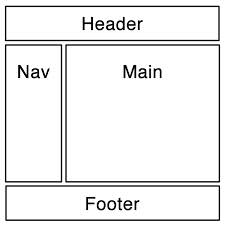 But is there a way to bring this to HTML5.1? Seeing that the majority (yes, there are always exceptions) have a navigation bar on top, fixed or not, a menu on the left or right and content on the other side, we should have a few extra tags there.
This could easily be fixed with a:
  <html>
  <head>...</head>
  <body>
    <header>
      <navbar fixed="true">
        <logo src="logo.gif" />
        <navitem href="/about">About Us</navitem>
        <navitem href="/services">Services</navitem>
        <navitem href="/content">Contact</navitem>
      </navbar>
    </header>
    <content>
      .. content goes here ..
    </content>
    <aside>
      <menu>
        <menuitem href="/profile">Your Profile</menuitem>
        <menuitem href="/favorites">Favorites</menuitem>
        <menuitem href="/cart">Cart</menuitem>
      </menu>
    </aside>
  </body>
</html>
In order to bring this in a correct way, let these HTML tags dictate what they are, yet let a user decide whether he or she has any preferences:
- Do you want the top bar to be sticky?
- Do you want the menu no top, left or right?
- Do you like big butt(-and cannot lie?)-ons or a more “professional” look?
I’m not saying we should totally discard CSS and its visual capabilities, but I think we spend too much time coding and consuming styles that don’t really make a difference. Users of the Links browser, the few that remain, probably have the last laugh; although I’m sure they’re missing their frame sets.
Leave a Reply